For the most part, everything in WWE is extremely homogenized. As we don’t get new sets for each show, they all blur as if they’re the same thing. Without a gimmick like the Royal Rumble match or Hell in a Cell, there’s nothing separating Backlash from SummerSlam, let alone the similarly named Payback immediately afterward.
Often, the only way we can even tell it’s a different event is by the branding that pops up on the screen. That makes the logos and the iconography framing each event particularly important to give audiences a feeling of variety and change.
This year, we saw Extreme Rules turn into “The Horror Show” and swap the red X they’ve been using for years in favor of a purple and green design. Jarring at first, but I got used to it and I like some of that even better, even if it feels a bit 90s/early 2000s to me with that coloring.
But since SummerSlam is one of WWE’s longest-running events and the current focal point right now, I’ve been seeing a lot of that logo and it got me thinking about how it’s changed over the years.
So indulge me as I geek out and break down the history and evolution of the WWE SummerSlam logo from its debut to its current incarnation.
The very first proper logo for SummerSlam was something WWE used for the first 10 years of running the show.

For the inaugural event, it was actually styled “WWE SummerSlam ’88″—something that wouldn’t become the norm, as it went away even the very next year.
By and large, this logo stayed the same outside of some color variations, like the SummerSlam 1991 poster.

Personally, I’m a huge fan of this. It’s simple, but bold. Sometimes, I feel like wrestling companies try too hard to make their logos seem edgy and violent to the point where they’re as ridiculous as heavy metal band bands all having the same pointy design.
In theory, it could work for nearly any event, though. That’s one of, if not its biggest criticisms. If you replaced the words SummerSlam with another show title, it would still work. Don’t believe me? Check out this alteration I made:

Hell, that’s even partially what my Smark Out Moment logo is based on, albeit with some tweaks to allude to the WWE logo’s color scheme.
There’s nothing inherently “summer” about it it. This could easily be Survivor Series and you wouldn’t question it. But that’s where my favorite version of this logo comes into play with a variant they did for SummerSlam 1994:

Look at how something as simple as converting the 2 bars to waves changes this from a simple underline to evoking feelings of a heat wave! That’s a brilliant touch and whoever did that deserves a pat on the back. However, in an ideal situation, it would look a little less like bacon. This version is even better.
If I had it my way, this would still be the logo today, with a few tweaks to the stroke, the bacon-wave and so on, but I love the sun in the background and this overall concept. And yet, it was only used in some promotional material for 94 and 1995, but not even the main 95 poster. It’s yet to reappear in anything significant ever since, as WWE went back to the standard for the next few years.
For 1997’s Bret Hart vs. The Undertaker match, they added the tagline “Hart & Soul” to the posters. It wasn’t really ever incorporated into the logo itself, from anything I’ve found, but it’s worth mentioning. This year, we’re getting the “You’ll Never See It Coming” subtitle. Just food for thought that they never seem to want to go with “The Biggest Party of the Summer”, which is the official nickname.

For 1998, WWE ditched the formula and the regular logo for what I consider to be one of the absolute worst of the bunch in over 30 years:

Yikes. The generic 3D SS letters and the incredibly basic text in the center feels more like a last-minute emergency thing to toss up onto the screen, rather than a logo that the graphic design team labored over.
They ditched the SS for the next year and tilted the text, but it’s still nothing impressive, even with the added flames around the name:

Very Sunday Night Heat, right?
That took us into 2000 through 2008, which had a brand new, entirely different approach to the SummerSlam branding and logo:

Gone were the yellow/gold and blue, as well as the orange/black/silver motif. Instead, this was distinctly of its era, which had a lot of green and blue in its predominant color schemes. They popped on black. Look at WrestleMania 2000 with its green on black. Very Matrix-like.
I’m not the biggest fan of this. The small blue S behind the big green S is too hidden. Plus, the design and the colors still don’t give me a summery vibe. For that matter, this doesn’t even strike me as a wrestling show. It could very easily be a clothing label or a soda like Surge.
They do step it up and give it a much more summer feel to it with the 2007 variation that adds sun rays to it:

That’s a massive step up, but I still think the color scheme doesn’t suit it and I don’t like the jagged, thin font for the lettering.
In 2009, WWE would shift over to the first testing phase of what would become the modern SummerSlam logo concept of the letters stacked on top of each other with a star behind it. The first go-around was not bad, but definitely amateur:

The black circle with the extra stars in the background were obviously unnecessary. The concept was good, but it was a matter of tweaking it. You need the right star and the right fonts as well as the proper colors to mesh well together.
For 2010 and 2011, they tried these variations:
![]()

Those were pretty ugly, but they were still trying to figure it out. It’s just a bit too busy and the font and star shape were still wrong, along with the colors. At a quick glance, it’s hard to read Summer on that, since it blends in so much with the chrome stroke on the star.
For 2012, WWE got 98% there with the 25th anniversary logo:
![]()
As you can tell, it’s almost exactly like what we have now. The only differences are that once the scratch logo was retired in favor of the new WWE logo, the words SummerSlam were rotated, Summer received a different shade in its gradient, and the star behind it became flat and less tilted. That has given us the logo we see today:
![]()
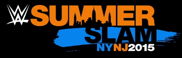
From 2014 onward, this has been our standard. WWE did mess around with a completely different idea for some of the promotional material for 2015, though:
And last year, with SummerSlam taking place in Canada, the logo received some tweaks in its color to fit the more traditional Canadian red:

But now, we’re back to what has become the SummerSlam logo, essentially. It’s got the orange and gold with blue color scheme from the original, some height to it from the green and blue instead of being horizontal, and the idea of the star from 2009 onward.
Does it feel like summer to you? To be honest, it still doesn’t give me that vibe as much as the wavy lines do. And if I had it my way, the word SLAM would be the same font (just with the white color, still) so it doesn’t look so awkward when you put the words together, like WWE did for this recent graphic:

But out of all the logos from over the years, if I can’t have the 1994 version anymore, I’m personally a bigger fan of the modern logo than anything else we’ve had. I’m fine with WWE not changing this up ever again and sticking with this.
What’s your favorite version of the SummerSlam logo? Do you have any alternative mock-ups or redesigns you’ve ever created you want to share with the class? Keep the discussion going in the comments below!
